
How to design an Edinburgh Fringe poster
By comedian and designer William Stone
We all know as performers that no matter how good, original, and groundbreaking your show is, it doesn't matter if no one comes to see it. That's why your poster and marketing materials are so important to your Edinburgh Fringe run; it's cliche, but first impressions count.
I've been doing graphic design and illustration for longer than I've been doing comedy, and over the years, I've picked up lots of work designing promotional materials specifically for comics. Understandably, not everyone can afford to hire a professional designer (what's that? Why yes, my prices are very reasonable), so on the day a new batch of Fringe shows go on sale, I have put together a simple guide for those who decide to create their own design materials.
WHO WHAT WHERE WHEN
Before you consider style, fonts, and so on, the most important thing is who, what, where, and when. You might think that's obvious, but I've seen countless posters that don't say when or where the show is.
Even if you've piqued someone's interest with an amazing photo you've spent loads on, audiences need to know when and where it's happening. Not only does this HAVE to be on the poster, but you should also remember when composing the design that these details are vital, and the amount of space they take up should reflect this.
Got an amazing quote from Jimmy Carr? Great! But it needn't take up half the poster. Similarly, people don't need to know you were a semi-quarter-finalist in Bob's Chuckle Hut Comedian of the Month, at least not as much as they need to know what time your show is on.
IT'S NOT IN THE DETAILS
Similar to the point above it's important to cut to the chase. In an ideal world, your poster would be 8ft tall and have a wall unto itself in the middle of Bristo Square. In reality, it's more likely surrounded by 436 other posters; if you're lucky, someone has even been considerate enough not to paste theirs over yours.
People aren't going to stop and read everything on your poster, so you don't need a paragraph explaining how your show subtly weaves the overarching themes of love and war into this pithy tale of being a student in Leeds. Save the bells and whistles for your flyer or website; your poster is a foghorn.
FACE UP
Some people may (and probably will) dispute this, but your face should be on the poster and should be recognisable. If you're on the telly five nights a week you can afford to just put your name on it and maybe a childhood photo or a drawing, but if you aren't one of those four comedians you need to do everything you can to increase the chances of someone seeing your poster and thinking: ‘Oh we saw them on that compilation bill once didn't we?’
People don't remember names nearly as well as they remember faces. You've probably had a conversation with a family member or friend that goes something like ‘That new comedian, you know the one, with the big pocket, nerdy looking, ginger hair, lanky, James something?’. So what chance do you have if they can't even remember the name of James Corden.
I won't offer a great deal of advice on photography as that is not my area of expertise, you only have to look at my Insta stories to see that. What I will say, and it bears repeating, it's got to be clear. Yes, you can take one at home on your iPhone but please make sure it's well-lit, it's in focus and there is space around you to fit all the other information.
I've been sent incredibly well-taken photos before but they're cut off at the forehead/arm/knee/whatever and the client is dumbfounded when I say I can't ‘zoom out’ of it or the title doesn't fit over their head.
THE LOOK
Finally, In terms of style, colours, and so on. Honestly, anything goes, it just needs to be clear. It's all about communicating who you are and what your show is about.
You should assume that your audience knows nothing about you, this is your shop window. If your show is about being a total mess of a person, the fonts can be scruffy, hand-drawn, or whatever, so long as they're legible, it's very much a case of substance over style with posters.
Conversely, if your show is about how your life has been a breeze, your Oxbridge education, and your dad footing the bill for your debut, actually, no, sorry I can't help you, maybe give comedy a miss.
If all else fails, do as I a trained graphic designer who's been working for 15 years do, just Google it mate.
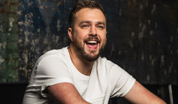
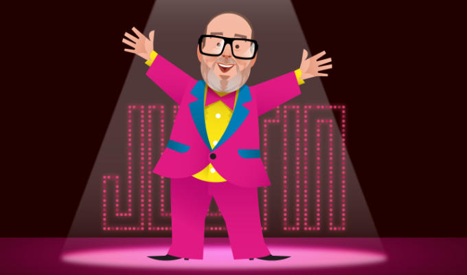
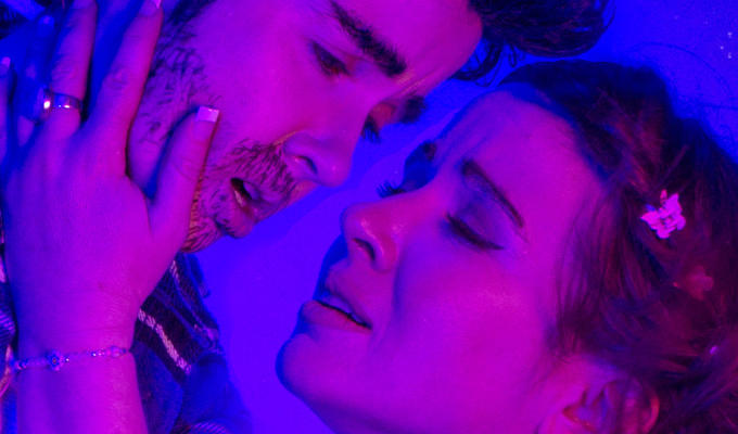
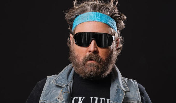
• William Stone is currently accepting commissions for festival artwork. Email williamstonecomedian@gmail.com. Here’s some of his work:

Published: 2 Apr 2025